Brands and Services Redesign
Brands and Services redesign
overview
Partnered with the marketing team to gather information around how Robert Half Staffing Professional users are accessing content in the Brands & Services and Executive Director pages on CONNECT (Intranet). Users were having difficulty finding relevant content on the Brands & Services and Executive Directors pages. To improve engagement with Brand pages and Brand materials, the UX Team recommended combining the Brand page and Executive Director page content. Based on what the UX Team learned during this project, the pros and cons of each page are as follows: By combining the pages, improvements will include: Simplifying the brand message by having all content on one page, elevating the Executive Director messaging to the page with higher engagement, creating a central resource for all marketing and brand resources and reducing the need for email communication.
Role
As a User Experience Designer/Architect, I and another colleague facilitated and documented qualitative responses throughout the user interview process.
Pre-Planning - Project Proposal
Document highlighting the purpose, goal, needs, planning – who, what, where, timing, interview test plan – scope, purpose, equipment, roles, proposed questions.
Interview Process Guidelines
Document outlining the scope, purpose, schedule and location, sessions, equipment, participants, interview, roles, role descriptions.
User Interview Script
Document outlining the intro, types of questions and exit to the script.
User Interview Assumptions
Based on the questions we asked, the UX Team proposed assumptions to predict the possible outcomes.
Detail Planning
The UX Team focused on the Discovery phase of this project and documented qualitative responses throughout the user interview process. The evaluation of the Brand & Services and ED pages was conducted by the UX Team in San Ramon, California from May 2018 to July 2018. During the semi-structured interviews, 26 participants, matching the user profiles provided by the Marketing Team, were asked to spend 15 minutes with the team. During this time, participants answered questions about site impressions, shared understanding of what participants say and why, and share their workflow and what they do and why.
Interviews Procedure
30-minute schedule blocks with one (1) participant per session: 1 min – introductions and interview set-up, 14 min – Scripted questions and answers, 15 min (additional) – Extra time for participants, or debriefing time for the team. Re-set room.
Schedule
San Francisco Office (on-site) – Friday, June 8th, 2018
Omaha Office (remote) – Tuesday, July 10th, 2018
Denver Office (remote) – Wednesday, July 11th, 2018 – Thursday, July 12th, 2018
Toronto Office (remote) – Tuesday, July 17th, 2018 & Tuesday, July 24th, 2018,
Boston office (remote) – Wednesday, July 18th, 2018 – Thursday, July 19th, 2018
synthesis & Analysis
Sample whiteboards from discussions.
Process review after first round of interviews.
Data analysis after San Francisco Interviews.
Data summarizing all Branch data for final analysis.
Branch Visits
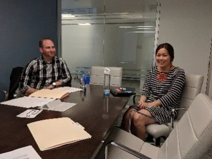
UX Team members Marina McCulloch and Joseph Liberty, and observer Katelynn Williams interview staffing professionals at the San Francisco office.
Existing Page Examples
Brand Page (The Creative Group)
Executive Director Page (The Creative Group)
Findings
Navigation
Users who access these pages are using the mega menu or search to find their desired content.
Depending on their time constraints, they may ask for help. Users do not appear to see the connection between the Brand page, Executive Director page, and the Operational President's page.
Many times, messaging is duplicated across all three pages. Users are confused on where to find relevant content, and do not often visit the Executive Director page unless prompted.
Design
Our findings show that 46% of users who frequent the Brand pages said they were able to find what they need on the page.
Some users commented on the fact that there is a lot of content available.
Those who visit the Brand pages are looking for brand-specific content, however if they do not have time, they will attempt to use search.
According to most of the participants, users feel frustration when they can't find brand-relevant content in the main search results.
Users find value in all campaign types: Word documents, PDFs, email templates, and signature pickers. Users also download unemployment reports and Salary Guides. In general, users are sharing this content with their clients. Only one participant mentioned browsing content for his own knowledge.
Comparison
Most users mentioned big brand sites including Amazon, Google, and LinkedIn. These sites contribute to their daily work and daily lives.
Those who listed Google described simplicity and ease of use. Most users liked LinkedIn because they can easily communicate with others and learn new information. They are also very familiar with the site in their day-to-day routine.
This behavior could contribute to the use of Yammer for communication and sharing of personal wins, industry best practices and tips and tricks. One participant used Instagram for self-promotion and marketing.
Participants that mentioned online shopping liked the curation of products, scrolling and refiners. When considering the participants' behavior as well as their favorite websites, it appears that users are mostly interested in finding results quickly, and less interested in browsing.
outcomes
In response to feedback gathered from the user interviews, the UX Team proposed an action plan to improve the Brand & Services experience. Goals for updates include: Simplifying the brand message by having all content on one page, elevate the Executive Director messaging to the page with higher engagement, create a central resource for all marketing and brand resources and reduce the need for email communication. The UX Team launched the new look and feel for all Brands & Services pages as well as the Business Operational & Thought Leadership Library at the end of Q1 2019. Ongoing testing will be positioned throughout the 2019 year.
proposed design
The Creative Group


